Home / Foundations / Brand & theming
Brand & theming
How to re-skin Triage from the token source of truth without touching component CSS.
One source of truth. Triage themes from tokens/tokens.json (W3C DTCG), including the dark theme. tokens/tokens.css is generated from it and the core stylesheets carry no :root — so a re-theme is an edit to one JSON file plus a rebuild, not a hunt through stylesheets.
Two token tiers
products should prefer the alias column; primitives stay one indirection away| Semantic alias | Resolves to |
|---|---|
| --surface-page | {color.bg} |
| --surface-card | {color.card} |
| --surface-subtle | {color.card2} |
| --border-default | {color.line} |
| --border-strong | {color.line2} |
| --text-primary | {color.fg} |
| --text-secondary | {color.dim} |
| --interactive | {color.acc} |
| --interactive-subtle | {color.tint-acc} |
| --status-success | {color.ok} |
| --status-warning | {color.warn} |
| --status-danger | {color.err} |
| --status-success-bg | {color.tint-ok} |
| --status-warning-bg | {color.tint-warn} |
| --status-danger-bg | {color.tint-err} |
| --ink-panel | {color.panel} |
| --ink-secondary | {color.panel-dim} |
| --code-bg | {color.codebg} |
| --code-fg | {color.codefg} |
| --surface-hover | {color.hover} |
| --surface-active | {color.active} |
| --text-soft | {color.fg-soft} |
| --text-placeholder | {color.placeholder} |
| --text-on-ink | {color.on-ink} |
| --interactive-ink | {color.acc-ink} |
| --focus-ring | {color.focus} |
| --surface-bar | {color.bar-bg} |
| --surface-scrim | {color.scrim} |
| --log-success | {color.term-green} |
| --log-warning | {color.term-amber} |
| --log-danger | {color.term-red} |
| --log-secondary | {color.term-dim} |
| --log-time | {color.term-time} |
| --control-border | {color.border-control} |
| --interactive-border | {color.acc-line} |
| --status-success-border | {color.ok-line} |
| --status-warning-border | {color.warn-line} |
| --status-danger-border | {color.err-line} |
| --interactive-solid | {color.acc-solid} |
| --status-success-solid | {color.ok-solid} |
| --status-warning-solid | {color.warn-solid} |
| --status-danger-solid | {color.err-solid} |
| --surface-banner | {color.banner-paper} |
| --text-ink-soft | {color.ink-soft} |
| --surface-banner-ink | {color.banner-ink} |
Alias usage
both tiers are emitted by tokens.css/* prefer semantic aliases in product code */
.panel{
background: var(--surface-card);
color: var(--text-primary);
border: 1px solid var(--border-default);
}
.panel .meta{ color: var(--text-secondary); }
.panel.danger{ border-color: var(--status-danger); background: var(--status-danger-bg); }
/* primitives remain available for one-off art direction */
.hero{ background: var(--ink-panel); color: var(--code-fg); }Logo & mark
assets: mark.svg · brand/README.md · generated by tools/build_brand.py TTriage
| Property | Rule |
|---|---|
| Construction | 24×24 ink square · accent chip (4 units) on the leading edge — the banner/toast motif · white T drawn with a 3-unit round-cap stroke |
| Clear space | half the mark height on all sides; never place text or borders inside it |
| Minimum size | 16px UI, 32px favicon raster; below that use favicon.ico |
| Colourway | white T on ink with accent chip is the only colourway; monochrome fallback = ink square + white T (drop only the chip) |
| On ink | invert the chip only if the mark sits on ink; keep the T white |
| Never | stretch, rotate, add radius, outline it, recolor the chip to a status colour, or set the T in another font |
Favicon & app icon
same geometry as the mark, no separate favicon artwork

 favicon.svg · favicon-32.png · apple-touch-icon.png
<link rel="icon" href="/brand/favicon.svg" type="image/svg+xml">
<link rel="icon" href="/brand/favicon.ico" sizes="any">
<link rel="apple-touch-icon" href="/brand/apple-touch-icon.png">
<link rel="manifest" href="/brand/site.webmanifest">
Ship favicon.svg first (crisp at any size), the
.ico (16/32/48, PNG-embedded) as the legacy fallback, a 180×180 apple-touch-icon, and a manifest for
install prompts. The chip stays ≥3px at 16px so the mark never turns into a black square. Generated deterministically
(stdlib PNG encoder, 4× supersampling) by tools/build_brand.py; CI fails on drift.
Brand strategy (one-pager)
Purpose. Make machine triage trustworthy: every automated decision visible, explainable and reversible.
Positioning. An operations tool for people who must answer for their inbox — calm, fast, auditable. Not a productivity toy, not a black box.
Audience. Operators and small teams who live in a shared mailbox; secondary: developers extending the system.
Personality. Precise, quiet, candid. Paper and ink, not neon; states the consequence, never blames the user; uses plain verbs and past-tense receipts.
Each line has a mechanism behind it: precision → tokens + spec; quiet → paper/ink; candour → voice rules;
trust → audit rows and approval gates. source
Logo variations
wordmark is set in Geist SemiBold with -0.02em tracking; the SVG falls back to system sans if Geist is absent




| Asset | Use | When not |
|---|---|---|
| mark.svg | app icon, favicon, tight UI corners | next to the full wordmark when space allows |
| mark-mono.svg | one-colour print, embroidery, fax-grade contexts | where the accent chip renders (it won't) |
| mark-ink.svg | ink/dark panels and photography | on paper — use mark.svg |
| lockup-horizontal.svg | documents, slides, e-mail | below 120px wide — use the mark |
| lockup-stacked.svg | square placements, avatars with name, covers | running text |
Imagery & photography
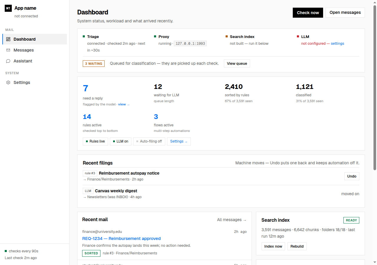
- Product shots are the imagery. Real UI on the grey paper, hairline frame, no device mock-ups, no drop shadows.
- People only if they are the subject (support, testimonials) — natural light, no stock handshakes, no AI faces.
- Diagrams are drawn in the system: mono labels, square nodes, status colours only when a status exists.
- No gradients, glows, 3D blobs or abstract AI swirls. Ink and paper carry emphasis.
- Dark assets: keep the ink square; never place the mark directly on a photo without a paper plate.
Print & colour equivalents
Pantone equivalents must be matched against a physical swatch — do not trust a script; ink coverage for large black areas should be 60/40/40/100, not 0/0/0/100| Token | Screen (sRGB) | CMYK (naive conversion) |
|---|---|---|
| --bg | #fafafa | 0/0/0/2 |
| --fg | #000000 | 0/0/0/100 |
| --acc | #0057d9 | 100/60/0/15 |
| --ok | #04713f | 96/0/44/56 |
| --warn | #9a4f07 | 0/49/95/40 |
| --err | #c81e2c | 0/85/78/22 |
| --panel | #000000 | 0/0/0/100 |
Applications & templates
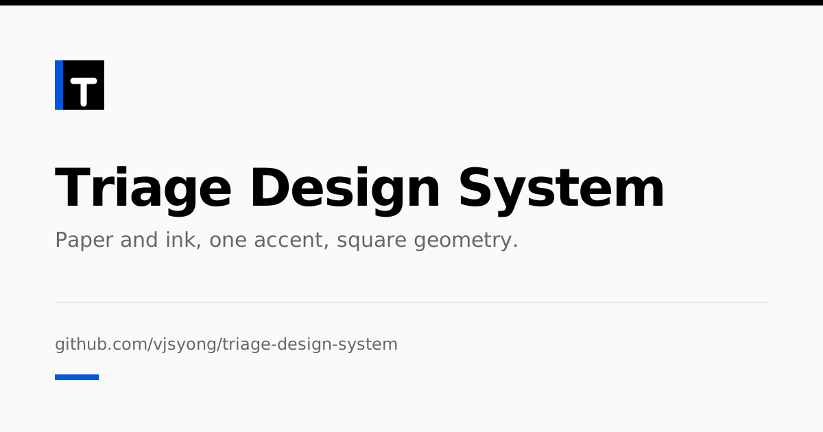
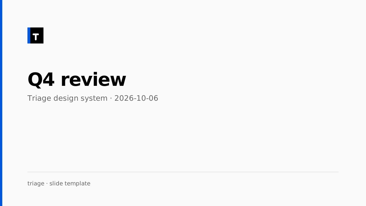
The email twin is table-based with literal hex values (clients reject custom
properties); keep it in sync when palette values change. OG defaults to 1200×630 paper with the ink rule; swap the title
per page. Release notes follow the changelog headings.
White-label checklist
what a white-label or rebrand touches| Element | What to change | Where |
|---|---|---|
| Name + mark | text inside .brand / .brand-mark / .brand-sub — no app name is baked into CSS | your shell markup |
| Palette | edit color in tokens.json and rebuild | tokens.json → tokens.css |
| Fonts | swap the two woff2 files + the two @font-face rules; scale assumes the 16px base | fonts/ + core/base.css |
| Radius | the system enforces border-radius:0 !important as policy; delete that one rule and add radius tokens if your brand rounds | core/base.css |
| Ink layer | black panels are emphasis, not a dark theme; retheme via --panel/--codebg/--ink-* | tokens.json |
| Status colour | keep the pairing rule — colour never carries meaning alone; the alias tier is --status-* | components |
| Dark mode | shipped: every colour primitive has a dark value in tokens.json; flip with data-theme or the OS preference | tokens.json → tokens.css |
| RTL | shipped via logical properties (TDS013); no RTL stylesheet | core + TDS013 |
| High contrast | shipped via @media (forced-colors: active) borders/system colours | core additions |
Brand block
The only brand-bound markup in the shell: a mark square, a name, and an optional sub-line.
Everything else is tokenised.
.brand-mark is a 24px ink square; replace the letters or swap the element for an <img> with the same box
<a class="brand" href="/"><span class="brand-mark">TR</span>
  <span class="brand-name">Your product</span></a>
<div class="brand-sub">sub-line (account, env)</div>
Do not theme by overriding components. The system's ground rule: colours, spacing and states come from tokens; a local override recreates the four-deletes-five-toggles problem the interaction standard was written to end. If a product needs a new look, extend tokens.json — then everyone gets it.
Triage Design System v0.13.1-experiment — the central, app-agnostic UI design authority.
Source of truth: /tokens/tokens.json. Showcase chrome only:
site/.